Here we are in Week 5 of the One Room Challenge (woot!), and I’m sharing all about the bedding. Week 5 means we only have seven more days before all of the incredible reveal shots are shared by the supremely talented and industrious folks participating in this inspiring and motivating online challenge. To catch up on my progress thus far, and to see links to all of the guest participants and featured designers, check the bottom of this post. It’s all there for you!
The Bedding
A comfortable, inviting bed is super important to me. We spend a good chunk of our lives in our beds, so in a master bedroom, a comfortable mattress and good quality bedding is key. In fact, I’ve written a couple of posts on bedding…How to Make an Irresistibly Comfy Bed, and How to Mix Bedding.
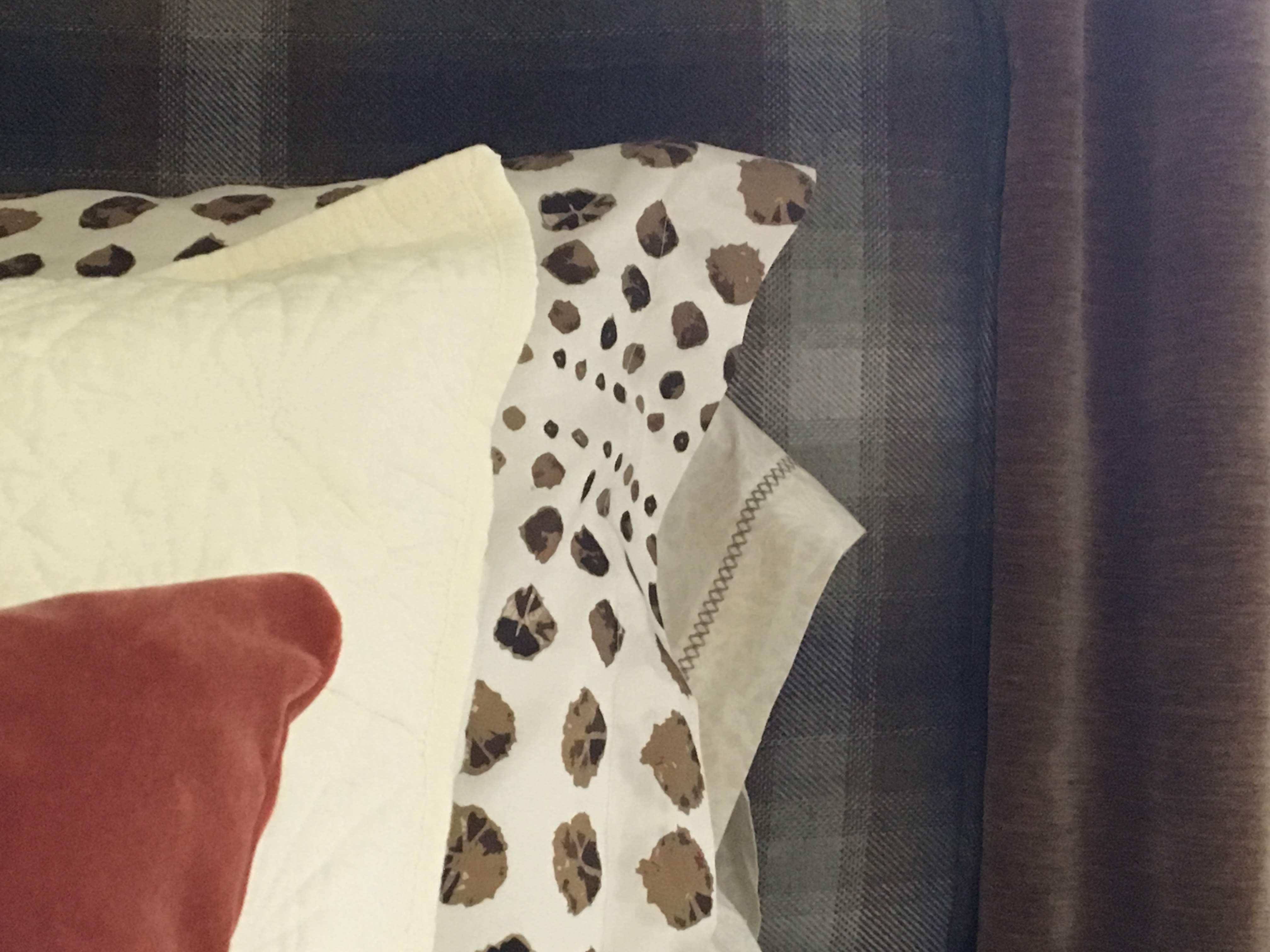
A few months ago I got an email from a company I have long admired, Spoonflower. Technically the email came from Roostery, their home decor line. I have always been impressed and inspired by the creativity and potential I see coming from Spoonflower and the folks who use their products.
In short, you can create on-demand, custom designed textiles OR shop from over 650,000 designs available through their Marketplace. You can order yardage from Spoonflower and construct your own projects, or order pillows, curtains, duvets, and lots more from Roostery.
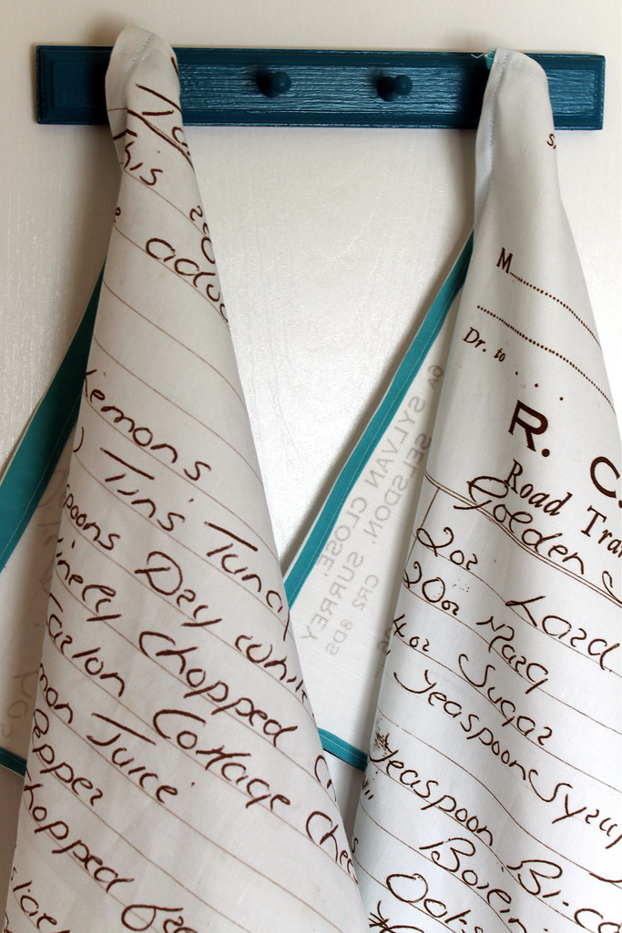
I think the first time I heard about Spoonflower was when I saw them turn a cherished hand-written recipe card into a tea towel. Such a genius idea, and a meaningful gift for a loved one.
The folks at Roostery had stumbled on my Spring ORC project, and were interested in collaborating with me on a future project. Of course, this bedroom came to mind!
The duvet and shams were the missing piece to this project, so I searched their gigantic library of designs and selected 5 potential prints.
Throughout this project, you know that my goal has been for a warm, masculine, inviting bedroom. To that end, I have been intentionally looking for menswear inspired fabrics. Plaids, pin stripes, tweeds, etc.
The beauty of this company is the sheer range of options. There were dozens of warm neutral stripes and checks for me to choose from, so getting the precise scale and color I was searching for was easy! And, if I hadn’t found what I was looking for, I could have designed my own print. My wheels are turning as to how I can utilize this for personal and client projects in the future.
So, the prints I narrowed it down to were these:
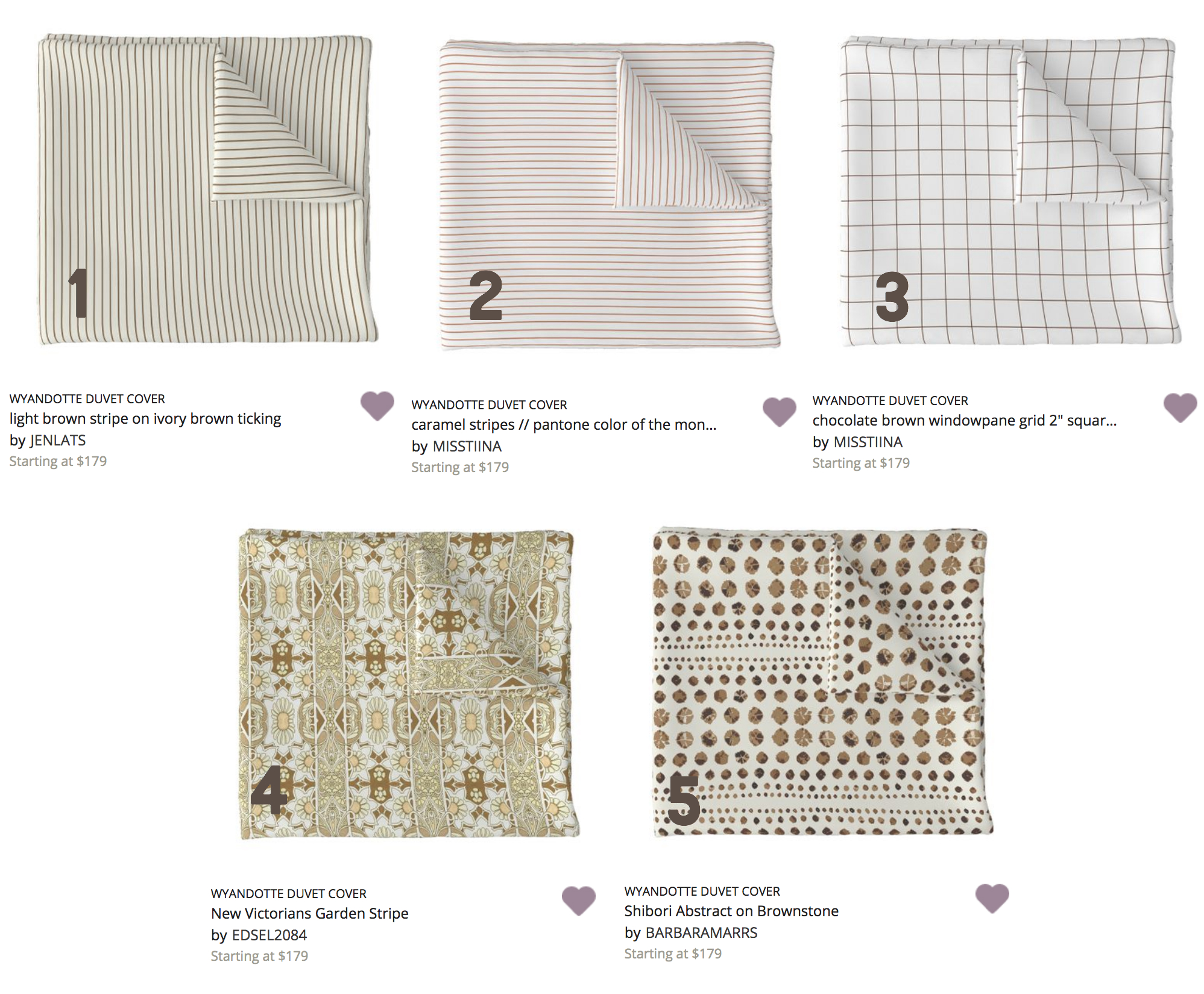
1. Light Brown Stripe | 2. Caramel Stripes | 3. Chocolate Brown Window Pane |4. New Victorians Garden Stripe | 5. Shibori Abstract
The top row are those classic stripes and window panes, and the bottom row are more like fabrics you might see on a neck tie or a vintage shirt.
I ordered swatches of the fabrics to see them in person, and eagerly awaited their arrival. They arrived crisply ironed and neatly packaged, and I immediately laid out the other fabrics for the room to see how they all worked together.
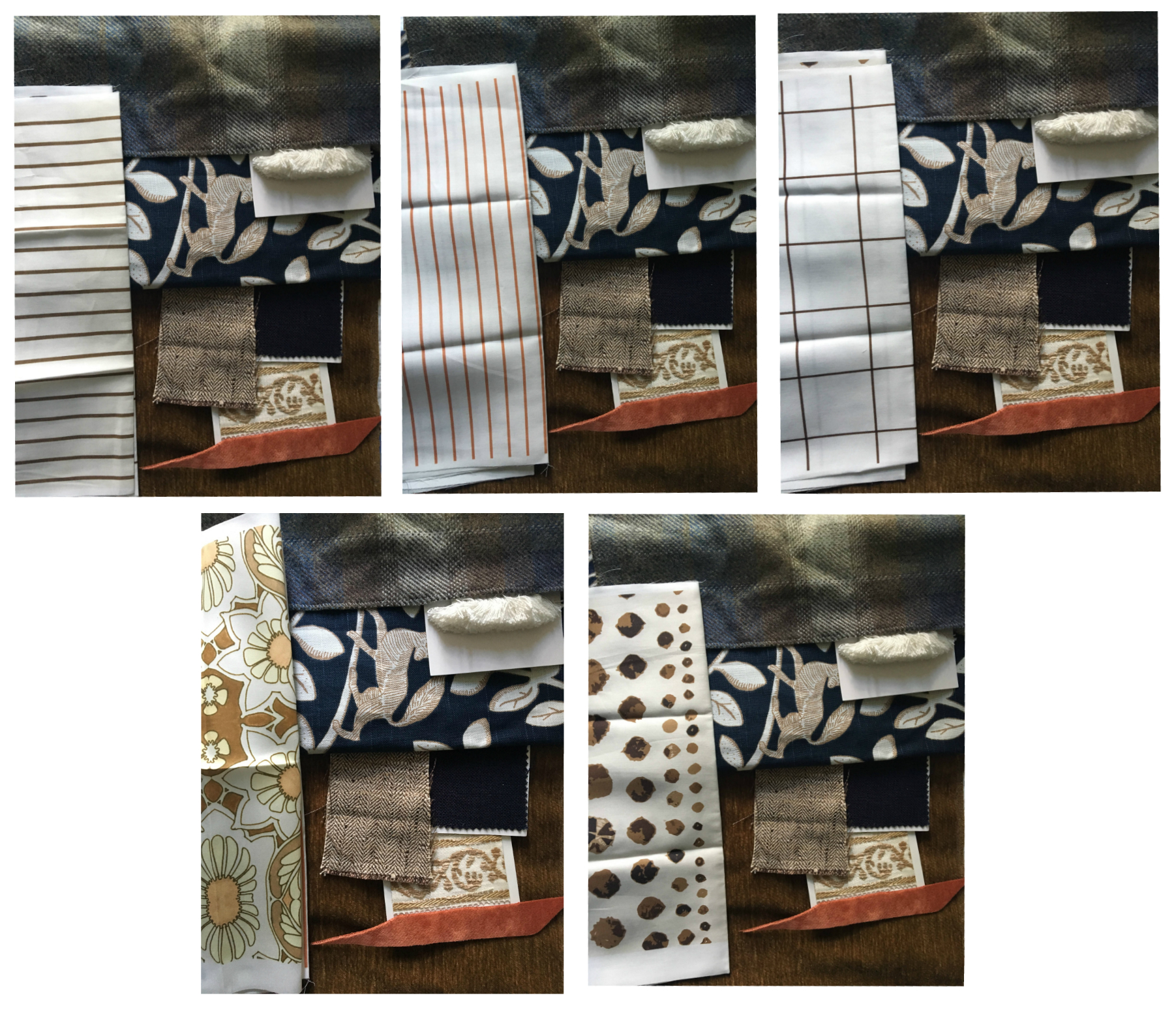
My top two choices were #3 (the windowpane) and #5 (the dots). You’ve seen a peek above at what I went with, so you know I decided to go big and bold with the dots! And, I LOVE them! I think it’s just the quirky, unexpected punch of pattern this room needed.
With the super fun dotted shams and duvet, I kept the rest of the bedding quite simple and went with a diamond matelasse coverlet from Target. It’s the perfect slightly creamy white to bridge the crisp white sheets (my favorite!) with the creamier duvet. The king pillow covers in the back are also from Target…that embroidered detail is so luxe. And, the quilted shams I picked up at World Market.
None of the whites and creams in the bedding are exactly the same, but I think that’s what makes it work. It’s a varied collection of tones that feels more authentic and interesting than if it were all matchy matchy.
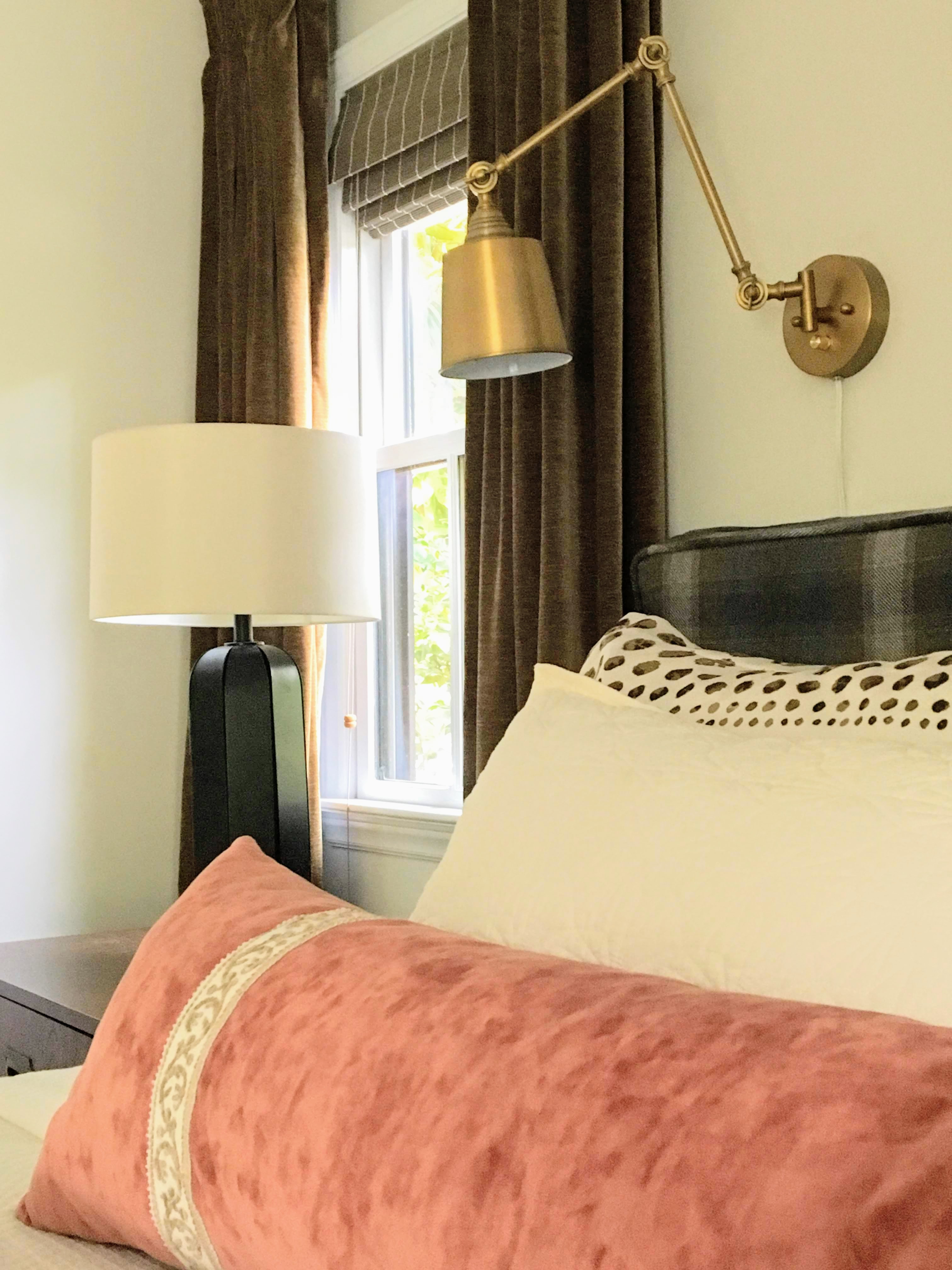
The long lumbar pillow I had custom made to add a spot of color. The rusty coral is repeated in the trees in the painting above the headboard.
In Other News
You may have noticed another new addition this week: the drapes! I found this gorgeous rich, brown, caramel velvet for a song, and had them custom made into drapes. They really up the visual warmth factor in the room and just feel so rich and decadent.
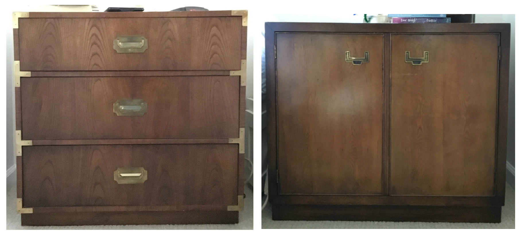
You can also see the night stands below. I had found the one on the left years ago at a thrift store, and recently stumbled on a similar sized, similarly inspired design at one of my favorite local spots, Union Camp Collective.
I do love a matching set of night stands, but I’m also a big fan of asymmetry and imperfect pairings. You can find more bedside table alternatives on my post here.
A huge thanks to Spoonflower for providing the duvet and shams!
Now that we’ve covered the big elements in the room, all that’s left is to share some gorgeous photographs of the styled and finished space. I’ll be back next week with those, along with a full source list of everything in the room.
Important Links:
The media sponsor for this incredibly fun and inspiring event is Better Homes and Gardens.
I am linking each week below as the challenge progresses:
My October 2018 ORC Posts: Week 1: The Befores | Week 2: The Plan | Week 3: The Bed | Week 4: Lighting and Art | Week 5: You are here! | Week 6: The Reveal
The Guest Participant Link-ups: Week 1 | Week 2 | Week 3 | Week 4 | Week 5 | Week 6
Featured Designers for October 2018:
At Home with Ashley | Brepurposed | Dabito
Erin Kestenbaum | Harlow & Thistle | House of Brinson | J & J Design
Kelly Golightly | Linda Holt | Megan Bachmann | Michelle Gage
Mimosa Lane | Murphy Deesign | Vestige Home
Old Home Love | SG Style | Shay Geyer
And, if you’d like to check out my April 2018 ORC, those posts are here:
Week 1 Befores | Week 2 Wallpaper | Week 3 Mirror | Week 4 Sink Skirt | Week 5 Storage | Week 6 Reveal
