It’s one of the trickiest dilemmas when decorating any room. How do I choose a paint color that feels intentional, but also isn’t too overt or matchy matchy? A recent client of mine asked this question. Lucky for her, I was there armed with my large scale paint samples to specify the perfect color for her home. (I would love to do the same for you, by the way!) But, let me share some fundamentals with you.

First Things First
The first thing to understand is that you must not simply pick a color out of thin air. Choosing the “best looking sample” (or one that looked great in a photo or someone else’s home) will inevitably land you with a color that relates to nothing. So, no matter what:
You must use the existing hard finishes to inform the color selection.
Here are a few questions to ask yourself: Is there a stone or brick fireplace surround? Is the trim crisp white or cream? What color do the counter tops “read”? Are the floors tiled or carpeted? The undertone of the flooring can be a major driving force in the wall color selection. (Wood floors can be more forgiving, and less bossy.)
The wall color must relate to the nonnegotiables in the house. This is the one most important thing to consider. For instance, if your home has gold beige carpet, gray walls are just not going to work (without some serious, well planned styling). If you have pink beige counter tops, yellow walls will clash terribly.
So in the very least, the walls must relate to the existing finishes. What this means is that the viable color options for your home are actually quite limited. The choices that have already been made in your home have narrowed the window of appropriate paint colors.
Another Consideration
Ideally the paint color should be chosen after the upholstery, drapes and carpet are chosen.
Logistically speaking, this is not the easiest way to do things. Many of us purchase a new home, and would like to get the rooms painted before we move in. This is, in fact, what we did when we moved into our home (before I learned these lessons and became a True Color Expert).
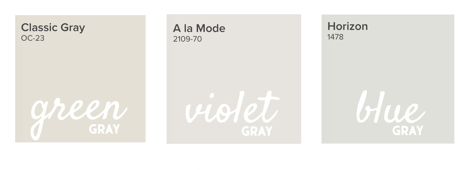
The problem is, choosing the paint color first immediately narrows the possibilities and options for all of the other decisions in the room. Even if you think you’re choosing the most neutral of the neutral colors, every single paint color has an undertone. That pale gray that you’ve chosen has either a green, violet, or blue undertone. And as soon as you bring in a gray sofa with a different undertone, the room will feel “off.”

Instead, find your sofa first (and your rug and your drapes). Then, these choices will direct the shade of paint you choose. There are a bajillion paint colors out there (that’s a technical term). So, it’s much easier to choose the exact shade once you have a palette. It’s MUCH more difficult to find fabrics that work with your walls. (For the record, this isn’t impossible. It’s just much harder, and will take much more of your valuable time.)
Invaluable Tool
Once you have determined some colors to consider for your space, the most effective way to decide on the ideal color is to see it in a large sample. The tiny 2″ swatches from the paint store can do more harm than good. It’s so difficult to see the true color, as it’s so small compared to everything else around it.
Be sure to use a large sample of the paint color (at least 8×11″) to see how the color truly looks.
I recommend painting a swatch on a piece of large foam core, but be sure to leave a white border around the paint. Having true white surrounding the new color prevents the existing wall color from affecting the way your eye reads the new color on the swatch.
This is just the tip of the color iceberg. There are so many considerations to make before choosing the best color for your room.
The most fool-proof way to choose color is to have an expert specify the color for you. As I mentioned earlier, I completed an intensive three day color workshop taught by Maria Killam where I learned all of the ins and outs of specifying color and how to read and understand undertones correctly. And I have put those skills to use over the past couple of years, specifying color for dozens and dozens of happy clients. Those skills, along with the 11×14″ color boards I have (over 100 of them!) enable me to hone in on the right color for the room very quickly.
I would absolutely love to specify the color for your home. Just think…the cost of my consultation is less than the cost of a paint job. Save yourself the time and uncertainty, and let me help you get your color right the first time! Click here to learn more about my consultations.
Here’s what a few of my clients are saying:
“Cate did a great job helping me pick a paint color remotely. She took into consideration the light in the room, the tile color and what I wanted to achieve with the space. I look forward to working with her again in the future – Her ideas are beautiful and functional.” -Emma B.
“I felt totally overwhelmed picking a shade of white during some repair/construction we were having done. One would think that white would be fairly easy to pick, but it WAS NOT. Cate offered so many options, walked us through our decision, gave thoughtful feedback, and worked with us to find a solution that would tie our whole house together. I love, love, LOVE the colors she helped us chose–even if they are both basically white!” –Christa L.
“Working with Cate on a nearly whole house interior repainting was one of the best decisions we made regarding our new-to-us home. Cate took the time to understand our vision for each area of our house. Her paint suggestions were perfect and made the space beautifully ours!” – Lisa M.
To recap: First consider the fixed elements, then select upholstery and window treatments, and finally use large samples to confirm your color.
What rooms are on your to-be-painted list?
xo
cate


