It’s that time of year when I’m getting a bit antsy and feel quite cooped up and ready for consistent warm, sunny days. Know what I’m sayin? Just a little bit of spring decorating can help us pass the long lingering winter days. I’ve pulled together some gorgeous pieces that just might bring a smile to your face and a spring to your step! Before I share the goods, I want to share an important tip to guide you as you introduce new decor or colors to your home (at springtime or anytime!). [If you’re thinking of changing your wall color, this is still relevant, but be sure to check out this post, too.]
This can apply to any home decor decisions you may make. Tuck this in your pocket (or bookmark it) and come back the next time you’re wanting to switch things up a bit.
Any color can be classified as either “clean” or “muted”.
Other terms you may hear for clean: crisp, pure, bright, etc. Other terms for muted may be: dirty, muddied, dusty. The only way to classify a color as clean or muted is to compare it to another color. Let me give you an example.
Take a look at these two shades of pink. Which is clean and which is muted?
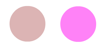
Muted on the left, clean on the right! You got it!
When considering neutrals, the same holds true. Any color is cleaner or more muted than the color beside it. In the scenario below, I’m showing a two common, but theoretical home palettes. One is cooler grays, and the other is warmer beiges:
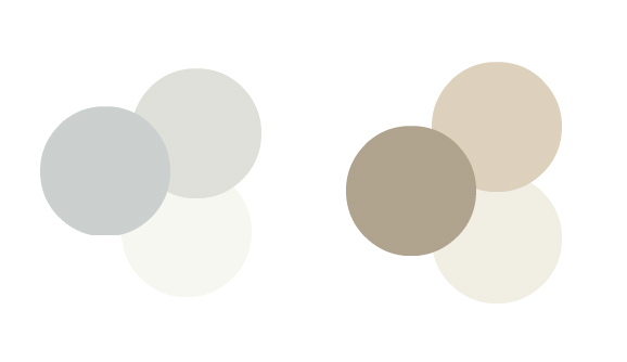
When comparing these two, the gray color palette is “cleaner” than the warm beige. The current trends in the US have us all choosing grays for our sofas and walls, though I can see that shifting a bit as earthier, warmer colors are showing up at Market, online, and in magazines. Neither is right or wrong, and both can be beautifully styled.
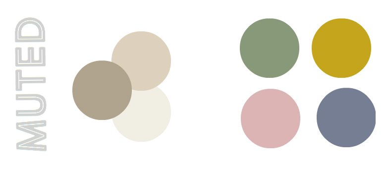
If your home has a warm palette with creams and beiges, it’s a safe bet to keep your accessories muted, as well:
If your home has a cooler palette with cooler grays and crisp whites, you can easily introduce more vibrant, bright accessories.

Keep the items in your home in the same range on the clean-to-muted scale.
If you were to plop a bright sunflower yellow pillow into that muted color palette above, it would just look…off. As spring approaches, we’re all itching to inject a bit of color and life into our homes. Following this color tip will help your home feel well planned and intentional, even as the seasons and your decor change.
Caveat: There are certainly exceptions to this rule, and a wide spectrum of clean-to-muted colors. Remember to always compare the color in question to something else, rather than considering it as a stand-alone (compare the potential new pillow to your sofa, for instance). Just because you have found a gorgeous pink pillow at Home Goods doesn’t mean it will look great on your sofa.
I noticed this distinction on two magazine covers in my to-be-read stack (do you have a stack, too?). One is more muted and one more clean.

Now, decide on a color or two that would compliment your home. I like to draw from an existing element. Perhaps the rug or a patterned upholstery piece has an accent color you haven’t considered using before. If you’d like more specific direction, let’s set up a General Consultation! I’ll help you hone in on exactly what you can do to spruce up your home.
I’ve rounded up some fantastic accessories to inject a bit of color into your home, and I’ve grouped them by color. Keep the clean vs. muted rule in mind as you consider new pieces. I’ve loosely ordered each row from clean on the left to more muted to the right.
Green Spring Decorating
Spring Decorating with Yellow
Pink Spring Decorating
Spring Decorating in Blue