Friends! I have been wanting to share this bathroom with you for so very long and, well, today’s the day! This little beauty was designed completely from scratch by moi (see the before pic at the end of the post), and on a budget. It’s so fun to have complete control over a space from start to finish. If you are building or remodeling a home here in Raleigh, I would absolutely love to help you create spaces that bring you joy and functionality. Contact me so we can chat!
When we purchased this home, we knew we would be converting a den and porch into a master bedroom suite (more info on that here). This gave me an awesome opportunity to design the layout of the bedroom, closets, and bathroom. I designed a modestly sized bathroom with classic fixtures, that will stand the test of time. I will list sources at the end of this post.
The window is North facing, so it does not get much natural light. Thus, please forgive the less than stellar photos.
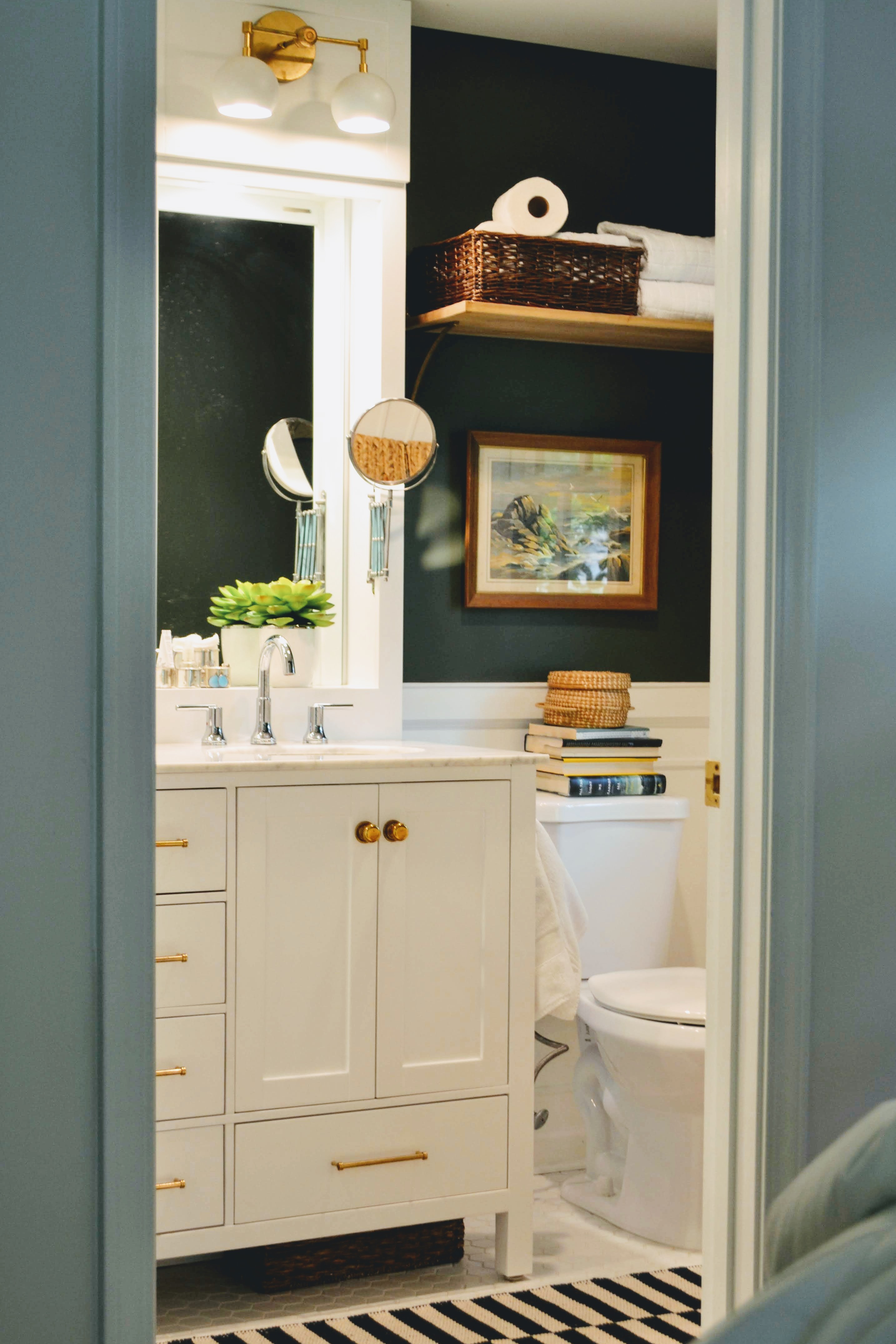
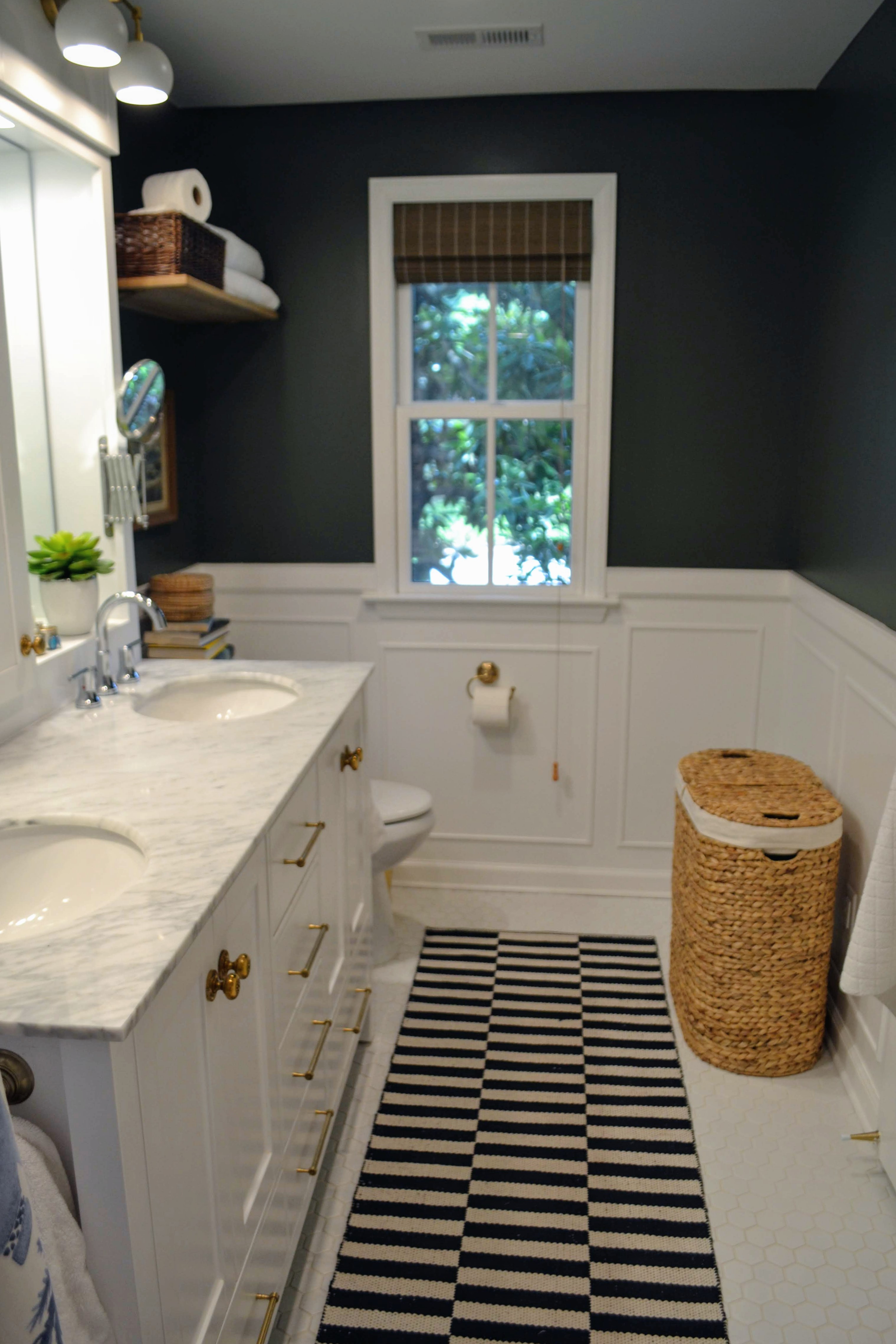
For the floors, I chose small white hex tile, and the tub walls are classic 3×6 white subway tile. The real statement in the room is the dark color on the walls. It’s a super rich, earthy green, which I just love to pair with fresh blue and white. The shower curtain is from Bed Bath and Beyond, but I embellished it by adding tassels from Amazon along the bottom. This gives it an interesting detail, and also allows me to hang the rod a few inches higher.
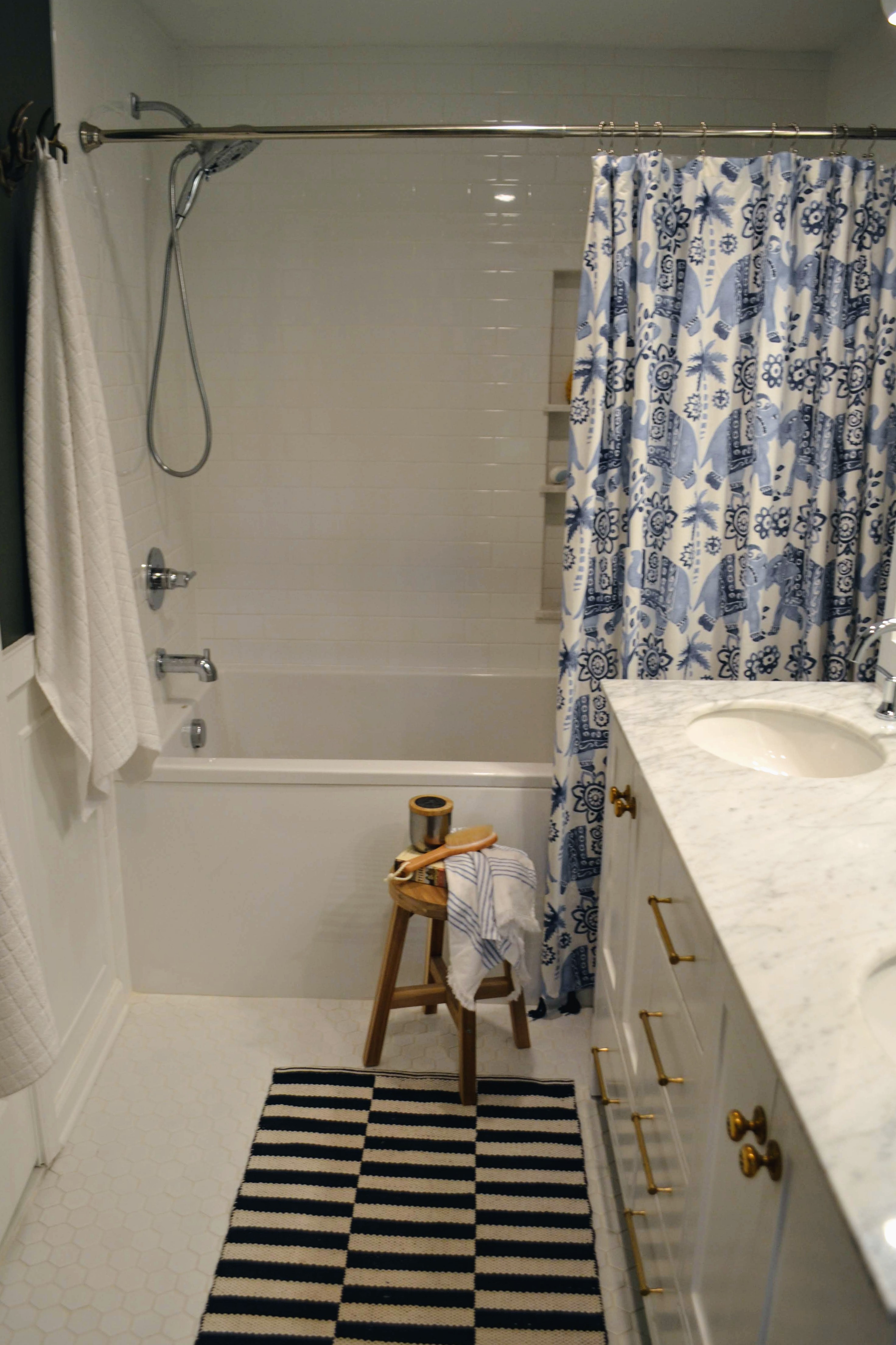 The splurge in this bathroom was definitely the tub. It may not look like anything special, but it is gigantic! I really wanted to be completely submerged, so we went with a 6′ tub, and it’s about 3′ wide, so it definitely fit the bill.
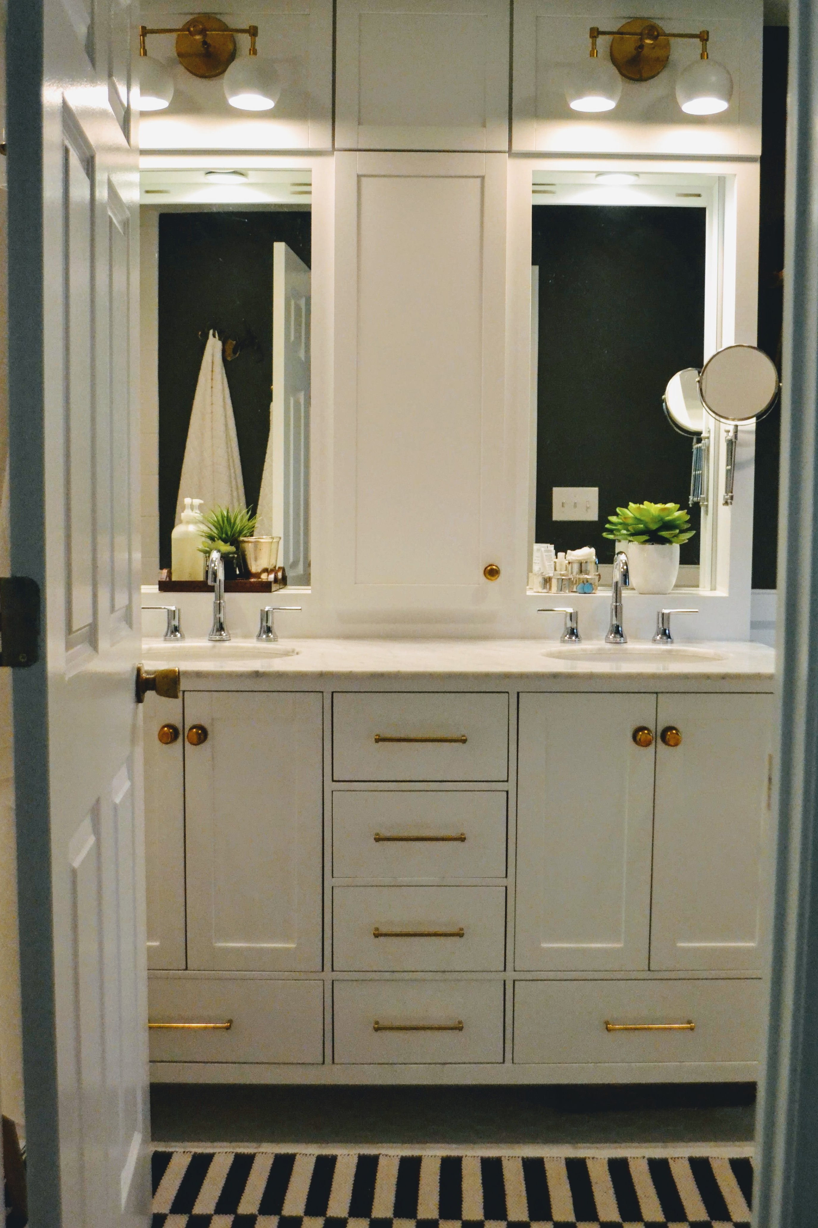
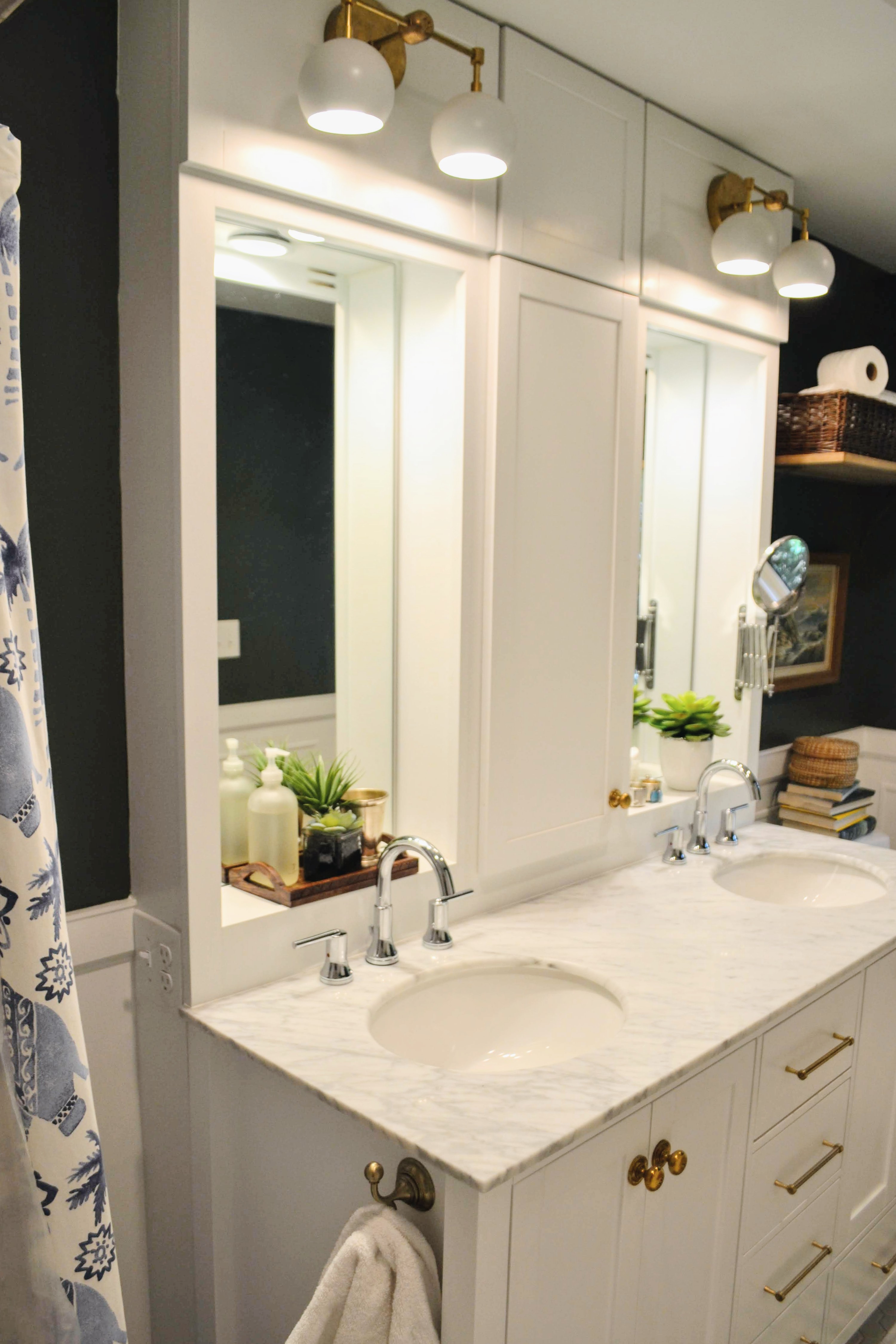
We saved money by purchasing the vanity (which included the marble top and sinks) from Wayfair. I switched out the hardware with natural brass pieces, and repeated the brass in the retro sconces and the hooks.
What makes the vanity special is the storage piece I designed to go on top. Actually, the vanity itself sits 6″ away from the back wall, and our carpenter build the custom piece that fills that gap and holds the mirrors, counter top cabinet, and sconces. I was determined to get some storage on top of the vanity, and this piece gives us just that. I absolutely love the way it turned out, and I think it makes our off-the-rack vanity look like a big custom piece. Above each mirror we have recessed lights that are independently switched on each side of the vanity. Outlets are paired with those switches for extra convenience.
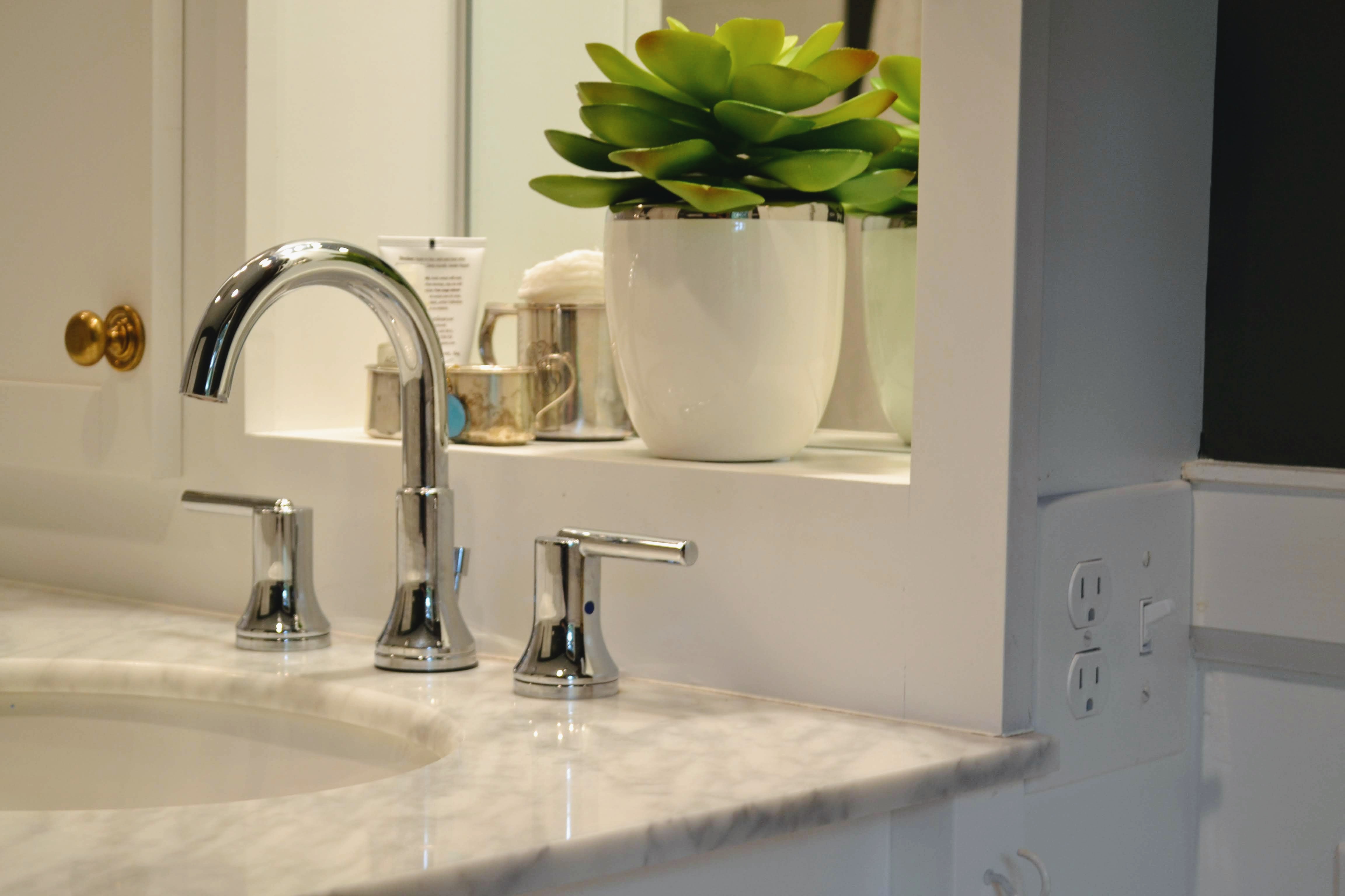 Mixing metals creates a more authentic and collected feel, so in this bathroom I used chrome for the plumbing fixtures and brass for everything else. My goal was for this room to feel like it could be original to the home.
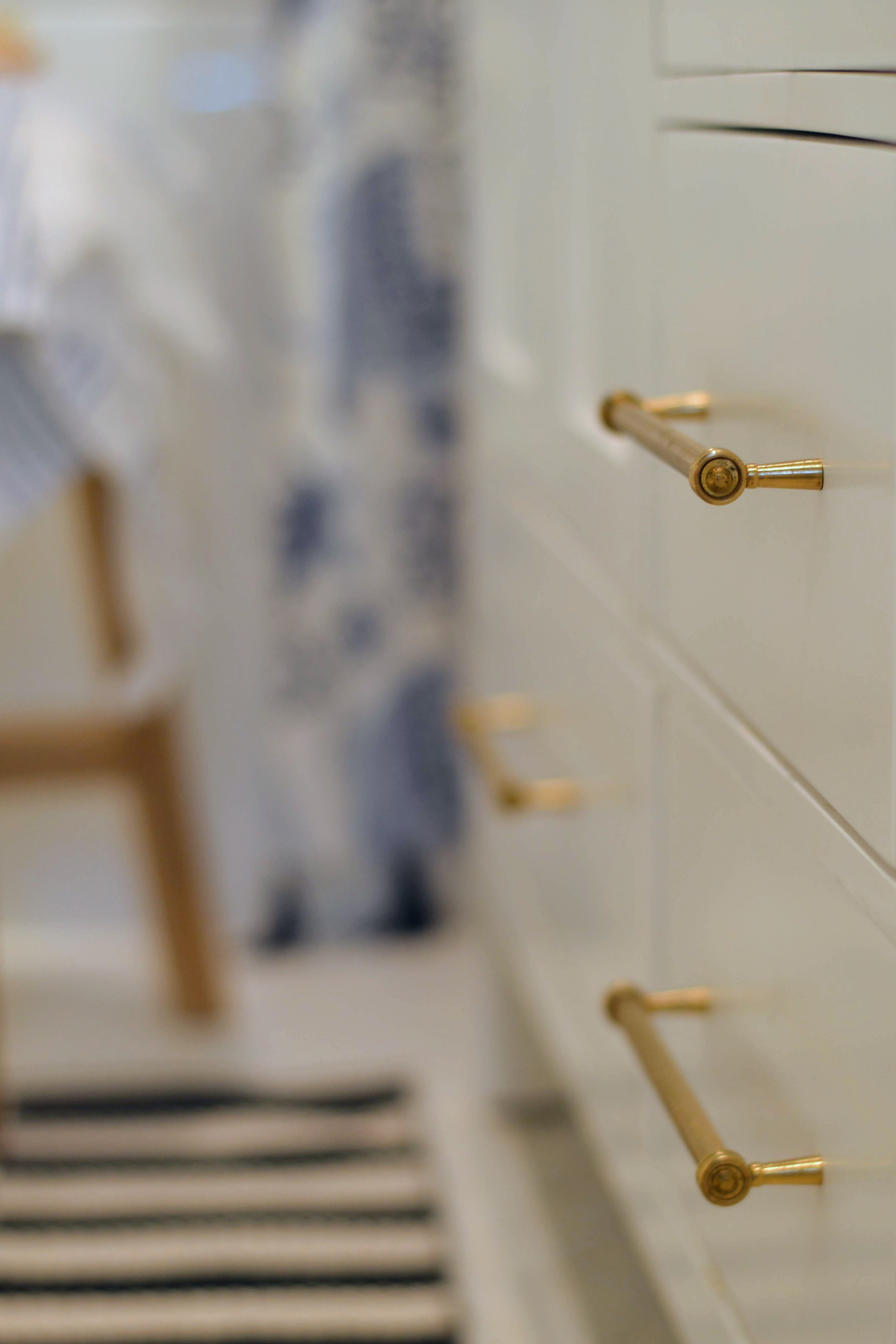
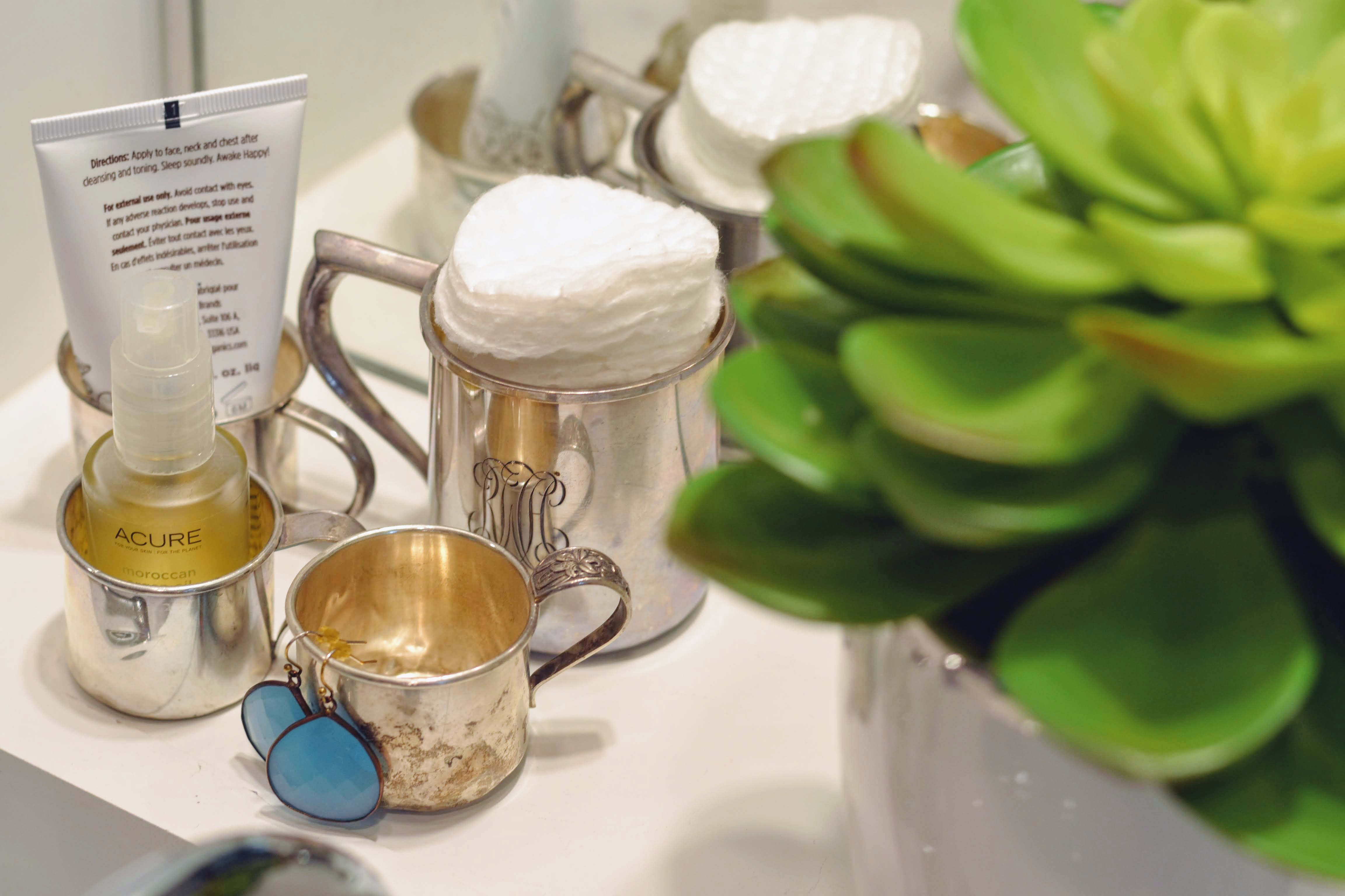 I think this goes to show that all white tile need not be boring! When I’m ready to move on from this bold, collected, eclectic look, I can paint the walls a soft neutral, bring in different accessories, and have a completely different space.
- Vanity, Wayfair
- Sconce lights, Etsy (no longer available; similar)
- Drawer Pulls, Deltana
- Knobs, Ebay (vintage)
- Towel Hooks, Home Depot
- Antler Hook, Anthropologie
- Shower Curtain, Bed Bath and Beyond
- Wooden Stool, Ikea
- Tassels, Amazon
- Faucets, Delta
- Rug, Overstock
- Laundry Basket, Overstock
- Woven Shade, Home Depot
- Cabinetry and Trim Color: Benjamin Moore Chantilly Lace OC-65
- Wall Color: Benjamin Moore Vintage Vogue 462
- Awesome Contractor: Bubba Watts of Something Constructive
- Stellar Carpenter: Jeff Witherspoon of Witherspoon Woodworks
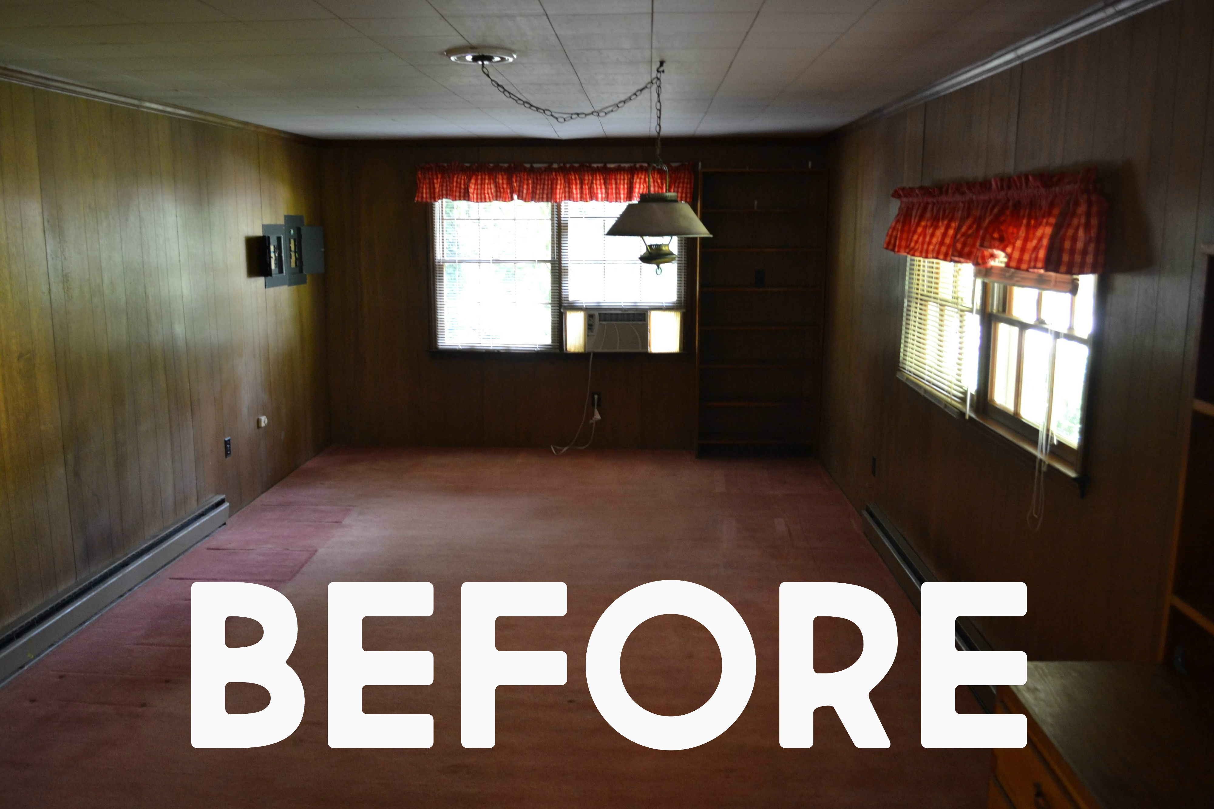
Finally, here’s the shocking before photo. The electrical box on the left would be just over the toilet (but we had it moved to a different location). The wall on the right was removed, and we captured the porch space as part of our bedroom. (You can see more details on the whole suite renovation on this post.)
